
Karel Martens
Unbound
News — Apr 30, 2025
From 11 July - 26 October 2025 the Stedelijk presents the first major retrospective of Karel Martens (1939), one of the Netherlands’ most influential graphic designers, who is still practicing today. Karel Martens is renowned for his inventiveness, and for his playful and experimental approach. For him, chance is important, and mistakes are opportunities for new discoveries.
ONE OF THE BIG THREE
Internationally, Dutch graphic design has traditionally enjoyed a strong reputation. Building on the modernist tradition of predecessors such as Piet Zwart, H.W. Werkman and Willem Sandberg, Wim Crouwel, Jan van Toorn and Karel Martens were the Big Three in the world of graphic design from the 1960s onwards. Where Wim Crouwel was known for his functional grid, that served to highlight content, and Jan van Toorn brought his activist and personal side to the fore, Karel Martens—as an experimental, curious and free maker—also revolutionized the way we look at graphic design, book design, and typography. With his ‘exploratory’ way of designing, he was a true pioneer.

Rein Wolfs, director of the Stedelijk Museum Amsterdam: “The Stedelijk has a long-standing history with graphic design, and we are proud to be hosting a major survey of this exceptional designer later this year. Karel is literally Unbound: the title of the exhibition refers to the unbound book, to Karel’s free and boundless way of working, and to the fact that he was one of the first truly free graphic designers. With which he remains a touchstone for future generations.”
-

Poster 21st International Poster and Graphic Design Festival of Chaumont, 2015 -

Book cover of 'Wim Crouwel - mode en module', 1997, published by 010 Rotterdam -

Telephone cards for PTT Telecom, 1994 -

Cover of OASE Magazine -

Cover of OASE Magazine -

Cover of OASE Magazine -

Book cover 'Op weg naar een vaderloze maatschappij', 1968, published by Van Loghum Slaterus -

Cover of OASE Magazine -
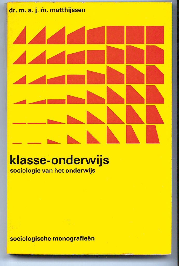
Book cover 'Klasse-onderwijs', 1971, published by Van Loghum Slaterus
PIONEERING AND PLAYING
For Karel Martens, it’s all about thinking, looking, and experimenting. “I love playing about, trying things out, not being quite sure, starting over.” Martens plays with color systems, numbers, word schemes, and algorithms, where one element arises from another. He frequently layers bright areas of color over one another and uses both digital and analog techniques. Marten’s ‘free’ work was always the basis for designs he created for clients like the PTT (the Dutch national postal service) and publishers such as Van Loghum Slaterus, Manteau, and SUN (Socialistische Uitgeverij Nijmegen).
Martens is also resourceful, able to do a lot with very little; his inventiveness and economy are apparent in his work. Keen to avoid waste, he repurposes newsprint, and the Stedelijk’s old archive cards. He doesn’t hesitate to stray from design ‘rules.’ For example, a text can start on the cover or be found in the margins. The architecture magazine OASE exemplifies his most ambitious experiments; no two issues are the same. Martens began designing OASE in collaboration with students from the Werkplaats Typografie, which he co-founded; today, he designs it with his daughter, Aagje Martens.
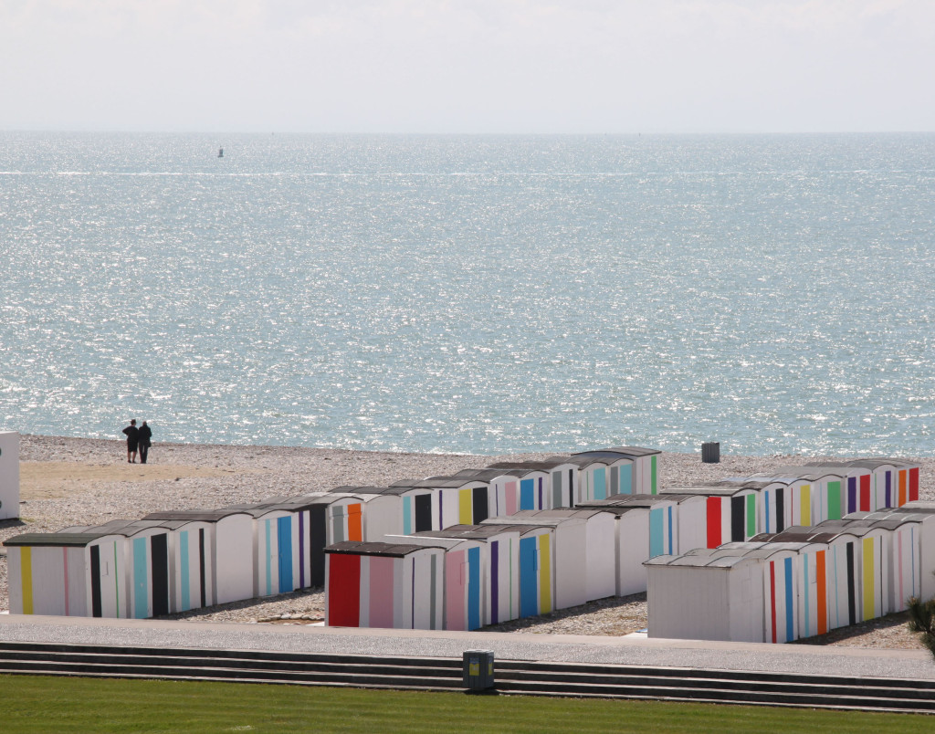
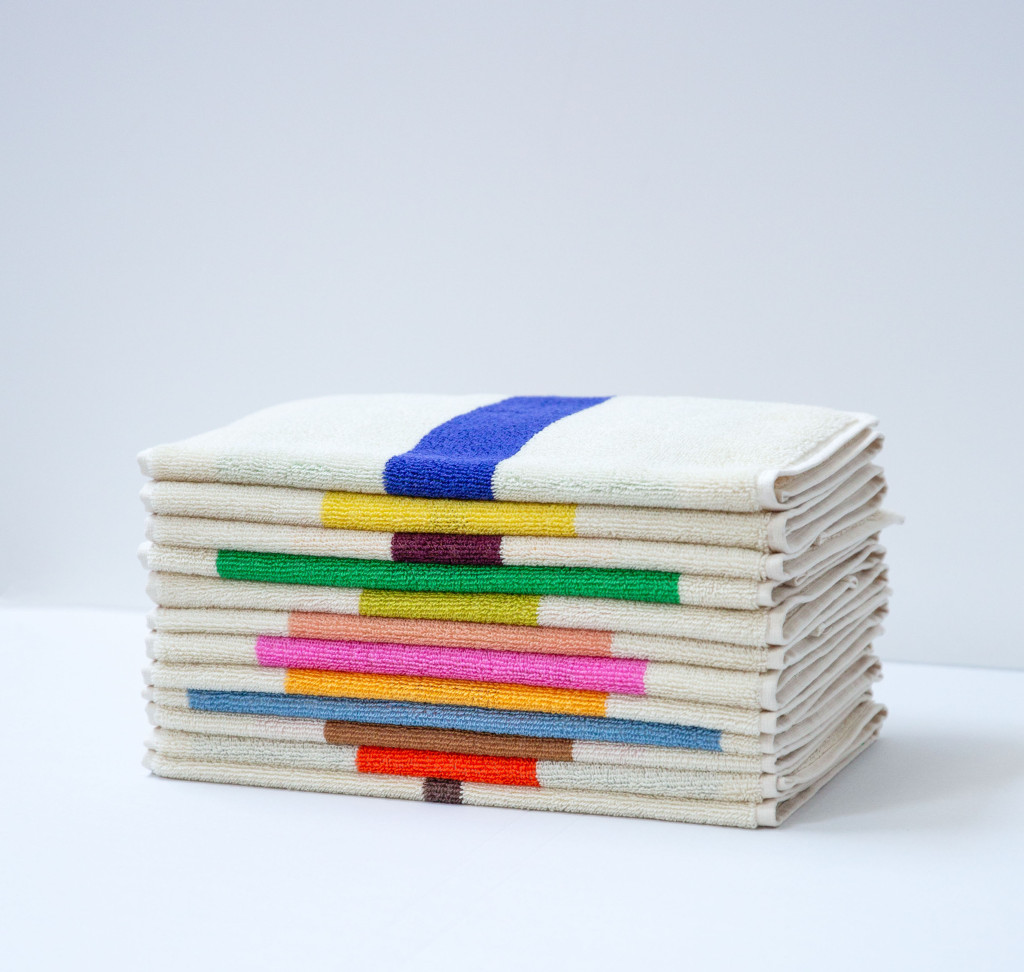
Since Karel Martens began collaborating with his children Klaartje and Diederik in 2019 under the name Martens & Martens, the scope of his work has broadened to include textiles and collaborations, such as with Suite702, which produces towels based on Martens’ color system for the beach cabins in Le Havre. Martens’ designs have also been incorporated into textile designs for Liberty London, Maharam, Hermès, DUM, Pop Trading Company, and Pentagram, among others.
EXHIBITION OF JOURNEY OF DISCOVERY
Comprising over 300 works, the exhibition is a journey of discovery through the rich oeuvre of Karel Martens. It features a comprehensive survey of his adventurous building lettering, such as that for the Nederlands Danstheater in The Hague, as well as every issue of OASE, and books, typography, postage stamps, telephone cards, and wallpaper he designed. Another highlight is a replica of one of his beach cabins, part of Couleurs sur la plage in Le Havre (2017), enlivened with a color system Martens designed using algorithms based on the city’s founding decree of 1517. The Icon Viewer he developed converts live images into Martens’ icon pixels. This gallery also displays the road surface design he created in 2024 for Amsterdam to make the 30-km speed limit visible and tangible.
The exhibition layout offers an impression of Martens’ studio. A collection of objects and pictures reveal his inspirations, and display units present his many designs. And, for the first time, visitors have a chance to glimpse Marten’s research and design process, thanks to countless sketches from his archive. At the reading table he designed, you can leaf through Martens’ designs to your heart’s content and, in the film room, see the designer at work and listen to designers he inspired.
NEW GENERATIONS
Karel Martens taught until an advanced age, until 2020, training and inspiring generations of younger designers in the Netherlands and internationally. ‘Learning by doing’ was always his motto, and he encouraged students to do their own research and find out for themselves what works and what doesn’t. Martens was a professor at the Jan van Eijck Academie in Maastricht, a guest professor at Yale University in the United States for 22 years, and taught for many years at ArtEz in Arnhem, where he co-founded the Werkplaats Typografie, which produced, and continues to produce, cohorts of talented designers.
PRIZES
Karel Martens has garnered countless prizes for his pioneering work, including the BNO Piet Zwart Prize (2023), the H.N. Werkman Prize (1993), the Dr. A.H. Heineken Prize for the Arts (1996) and the Gerrit Noordzij Prize (2012). His oeuvre publication Printed Matter (which he designed himself after winning the Heineken Prize) was awarded a gold medal at the 1998 Leipzig Book Fair as the best designed book of that year.

COLLECTIONS AND EXHIBITIONS
Martens’ work received international attention in media such as the New York Times and Emigre, the distinguished American magazine dedicated to visual communication and design criticism. Museums such as SFMOMA (San Francisco) and The Art Institute of Chicago included his works in their collections. Solo exhibitions abroad took place at P! New York City (2016), Kunstverein München (2017), 019 Ghent (2017) and Platform-L in Seoul, South Korea (2018/ 2019) and Ginza Graphic Gallery Tokyo (2013). The Stedelijk showed the work of Karel Martens in shows such as Mooi maar goed - Grafisch ontwerpen in Nederland 1987-1998 (1999), Werkplaats Typografie (2002) and in various editions of De Best Verzorgde Boeken and the Municipal Art Acquisitions.
PUBLICATION
The exhibition will be accompanied by an artist’s book, designed by Karel Martens, Susu Lee, and Jordi de Vetten, published by Roma Publishers. With essays by Rein Wolfs, director, Stedelijk Museum Amsterdam, and Thomas Castro, graphic designer and curator of graphic design at the Stedelijk Museum and curator of this Karel Martens overview. The publication will be on sale at the museum for € 39.80.
ACCOMPANYING THE EXHIBITION
The exhibition poster designed by Karel Martens will be for sale in the museum shop, alongside a selection of publications, Martens & Martens’ towels for Suite 702, Martens’ A4 wallpaper, scarves by Liberty and tea towels. Karel Martens will be interviewed by Thomas Castro during an Artist Talk (date to be announced). Inspired by Karel Martens, visitors of all ages can play with words and colors in the Letter Lab, at the bottom of the stairs, designed by design duo Koehorst in ‘t Veld.
NOTES TO EDITORS
For more information and images, please contact the Press Office of the Stedelijk Museum, pressoffice@stedelijk.nl.
The exhibition Karel Martens - Unbound is organized by the Stedelijk Museum Amsterdam and curated by Thomas Castro, curator graphic design of the Stedelijk Museum, in collaboration with Klaartje Martens.
The exhibition is supported by the Cultuurfonds.